A redesign of the desktop website of Adventuring for Life, with an emphasis on building trust and community for women travelers.
Role: UX/UI Designer
Team: Individual
Tools: Figma
While Adventuring for Life successfully drives interest through social media, its website fails to convert that interest into action. Disorganized content, confusing booking processes, and a lack of trust-building elements cause users to lose momentum.
Research: What I did
-
Competative analysis
Objective: Compare different travel EF Ultimate Break, We Love Spain and Contiki, see what they’re doing well, and where they fall short.
-
User survey
Objective: Identify the priorities of users while booking group trips
-
User persona and journey mapping
Objective: what the user wants to achieve in this scenario
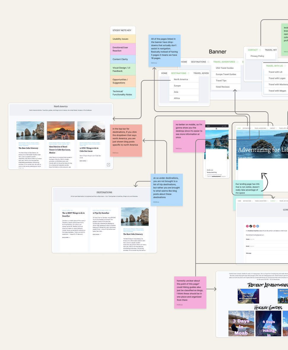
Main pain points in the existing design
Many images on the homepage are not connected correctly/ do not load
Banner isn’t straightforward, includes confusing drop downs
Pages with lots of information lack hierarchy and feel like blocks of text
There are many pages with lists of blogs, but no unified page to sort and see all blogs
Many pages were clearly designed for mobile and then not formatted for desktop
Research: What I learned
-
Based on the combined research, I compiled a list key concerns and behaviors, as well as key user needs.
-
Key User Concerns:
Trust is a major factor.
Social media drives legitimacy.
Transparency is non-negotiable.
Device flexibility is crucial.
-
Key User Needs:
Discover trips through Instagram and continue browsing without disruption
Quickly access clear details (dates, pricing, itinerary)
Browse casually without feeling overwhelmed
Understand what’s included in each trip at a glance
Solution
Value proposition
This alignment of user needs and business goals creates a cohesive digital experience that encourages exploration, builds loyalty, and supports long-term growth.
For users:
Adventuring for Life offers a trustworthy, inspiring platform where women can confidently explore, book, and share group travel experiences that is backed by clear trip info, real community stories, and a welcoming tone.
For the business:
The redesign will:
Support mobile-first traffic from Instagram and other platforms that use Linktree
Build brand credibility through social proof, transparency, and design consistency
Reduce user drop-off by improving usability and clarity
Showcase brand values like empowerment, safety, and connection to attract the right audience
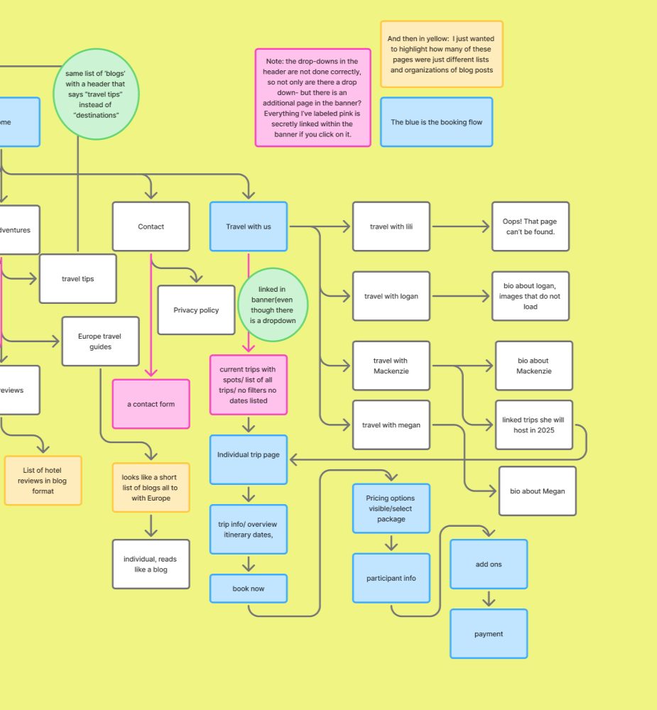
Information Architecture
To improve clarity and usability, I redesigned the sitemap to create a simpler, more intuitive flow. The goal was to reduce ambiguity, help users find trip and brand information quickly, and encourage return visits.
A key issue I found in the existing site was the disorganized blog structure, (which you will see marked in yellow) with multiple entry points led to scattered content with no central hub. In my proposed sitemap, I consolidated these pages into a single, searchable blog to reduce clutter and improve navigation.
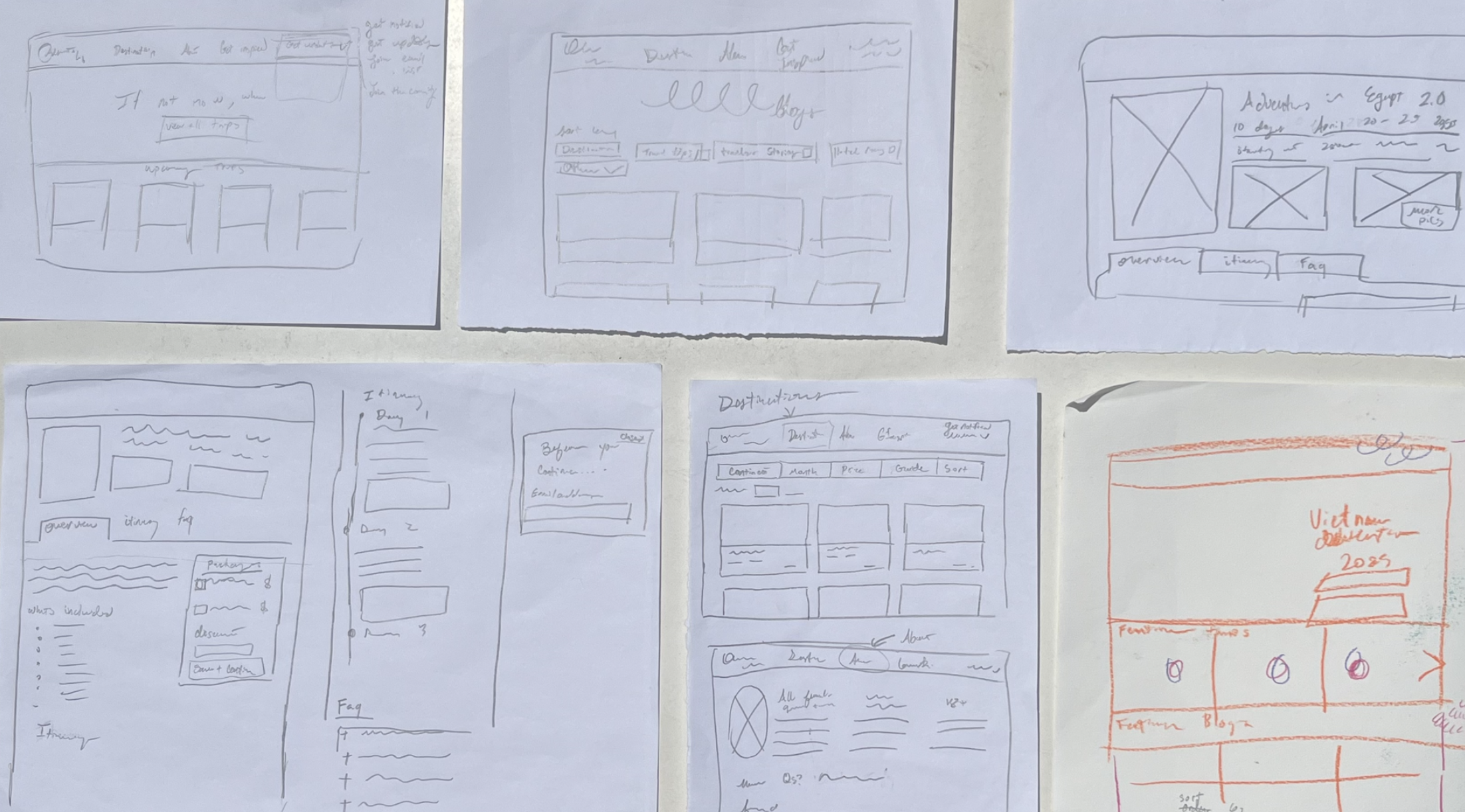
Ideation: Sketches and wireframes
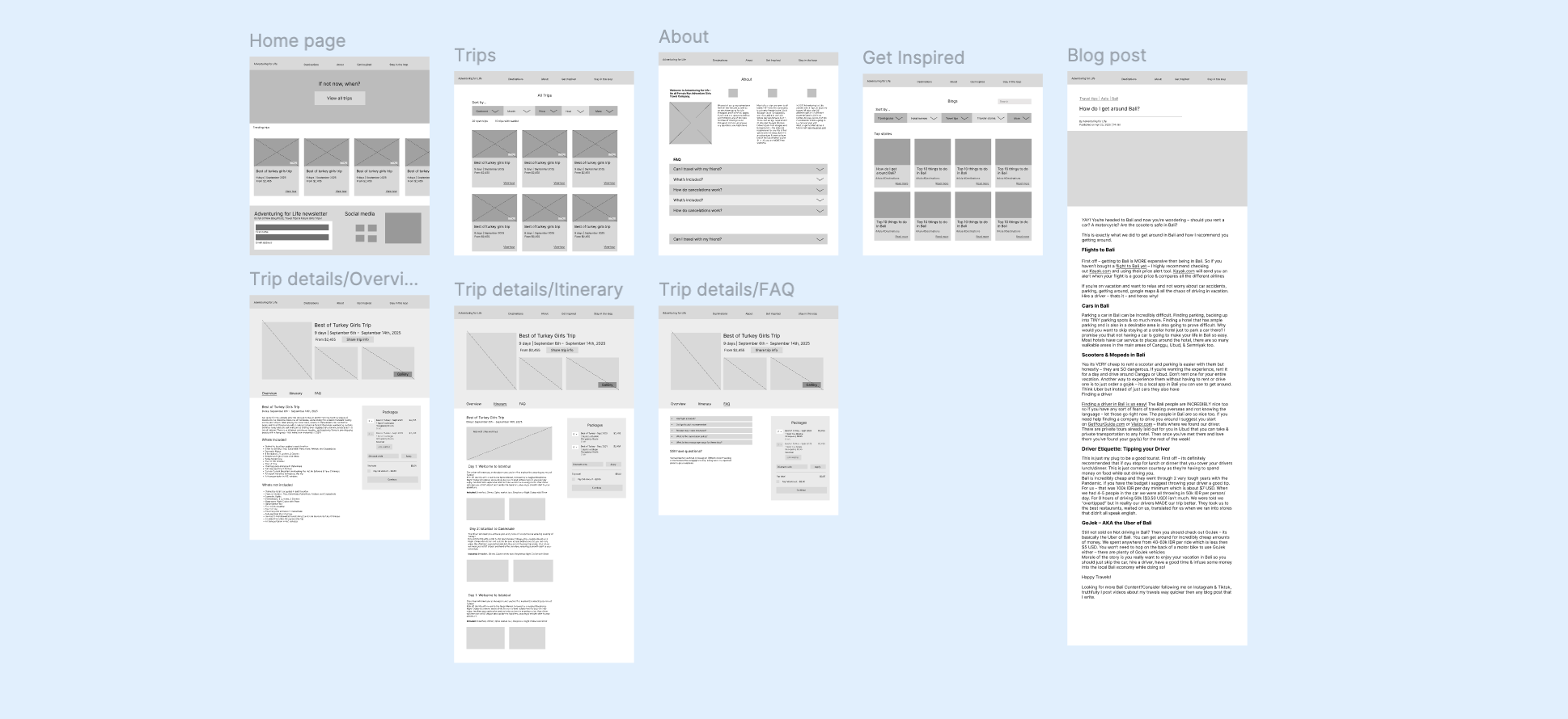
From Wireframes to Final Design
This walkthrough demonstrates the primary user journey from trip discovery to booking, focusing on clarity, trust, and ease of navigation. The high-fidelity prototype reflects a deliberate narrowing of scope: rather than designing every possible flow, I prioritized the moments that matter most for first-time and hesitant travelers.
Design decisions at this stage centered on simplifying information architecture, strengthening visual hierarchy, and presenting the brand in a way that feels both personable and credible. Key trip details are surfaced early, navigation paths are reduced, and the overall experience is designed to support both casual browsing and decisive action.
